Change Machine
Change Machine's financial coaching platform had the mission. It needed the experience to match. We redesigned the UX and UI to streamline workflows, simplify navigation, and expand what the platform could do for the organizations and people depending on it.

Change Machine is a subscription-based financial coaching platform that social service organizations and public agencies embed into their offerings to help people build financial literacy and stability. The platform serves two audiences at once: the practitioners guiding clients, and the individuals seeking to improve their financial health. Both needed a better experience.
The platform's three core components, Coach, Learn, and Share, had grown complex. We reviewed the full UX and UI and developed a design strategy focused on clarity, usability, and scale. We consolidated navigation into a single intuitive bar, organized data-heavy content with secondary navigation and color blocking, and created a comprehensive icon library of more than sixty icons to simplify wayfinding throughout. Data visualizations were redesigned to be bold, clear, and easy to act on. We also expanded the Share component into a Share+ toggle, giving larger stakeholders a more customized experience.
The result was a platform that works harder for everyone using it, helping more organizations deliver financial coaching, and helping more people make lasting economic change.


Streamlining and simplifying: Coach, Learn and Share, consolidated in one intuitive navigation bar.


Visualizing data, and providing a positive outlook.


Organizing and focusing data-heavy information with secondary navigation and color blocking.


Simplifying layouts and aiding navigation with a comprehensive icon library (over sixty icons created).
Expanding the “share” component to enable a more customized experience for larger stakeholders – toggle from Share to Share +.
Related work
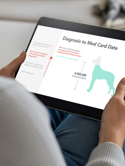
Mars Petcare Data Studio
Mars Petcare Data Studio
Kinship Digital
Kinship Digital