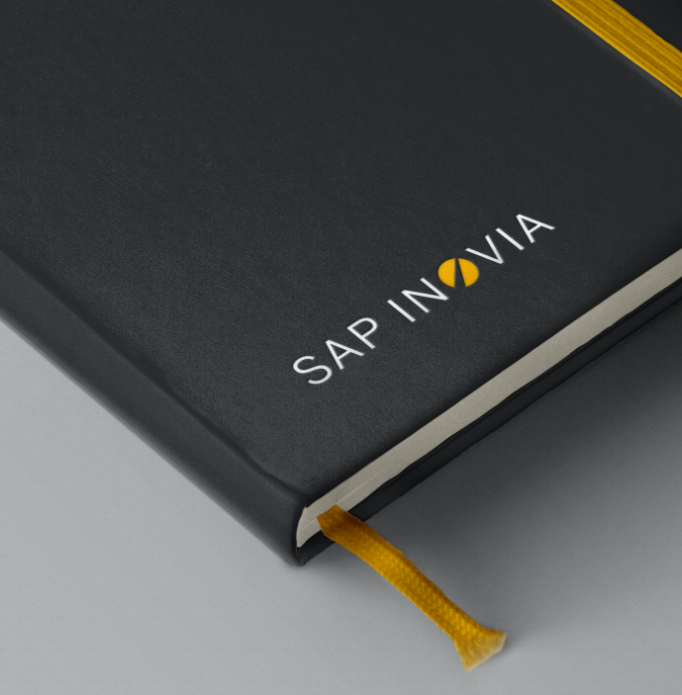
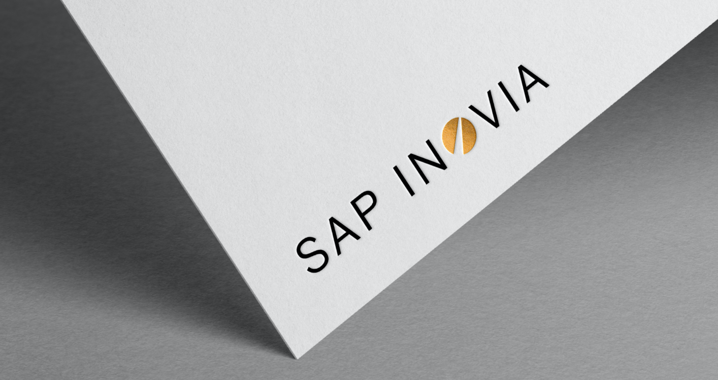
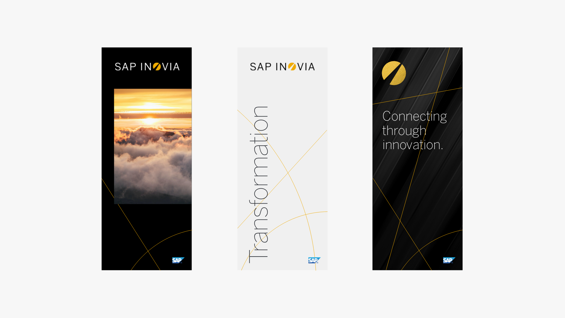
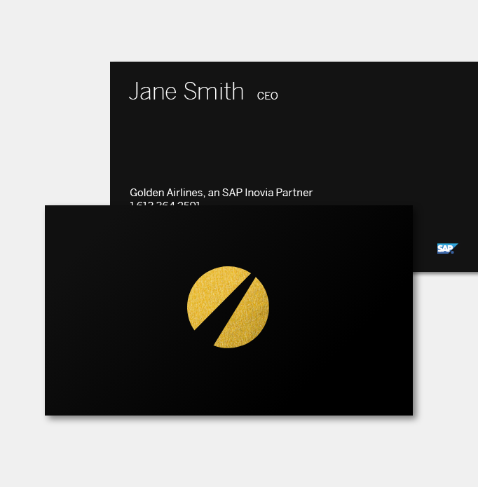
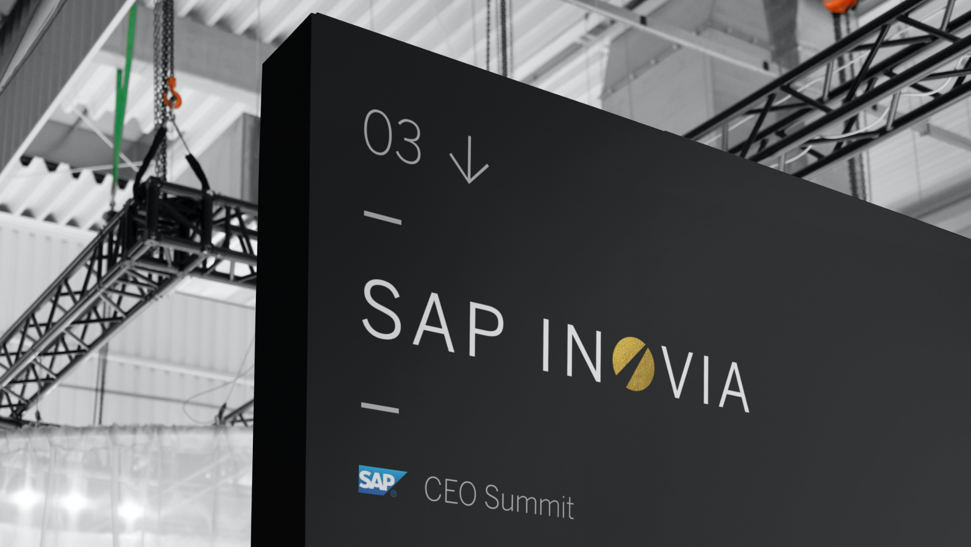
Bringing together “innovation” and suggesting momentum and “new ways” forward, the name inspired a logo design that was simple and dynamic, representing the path towards progress. The symbol can stand alone, both as a symbol of innovation, and as a sign of membership.
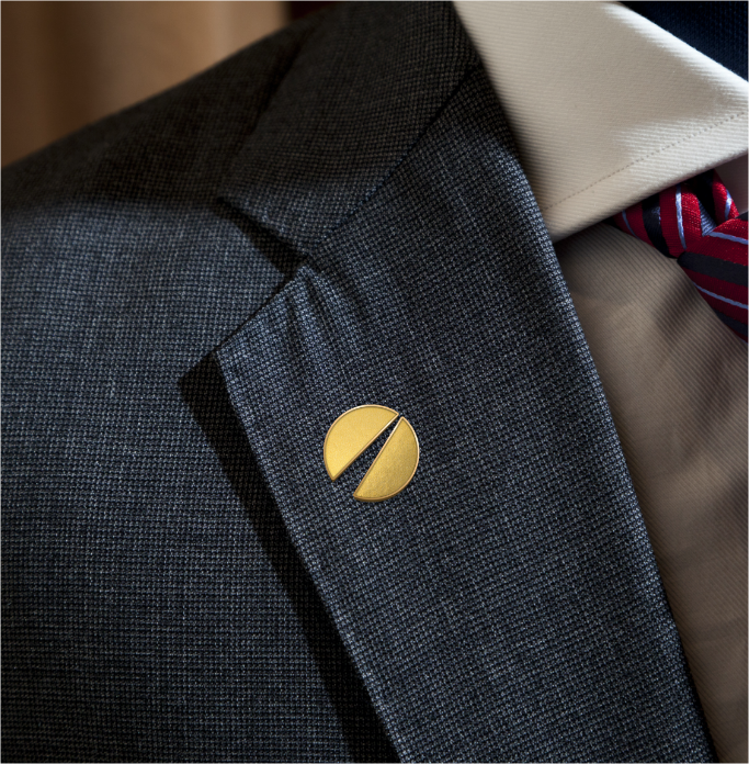


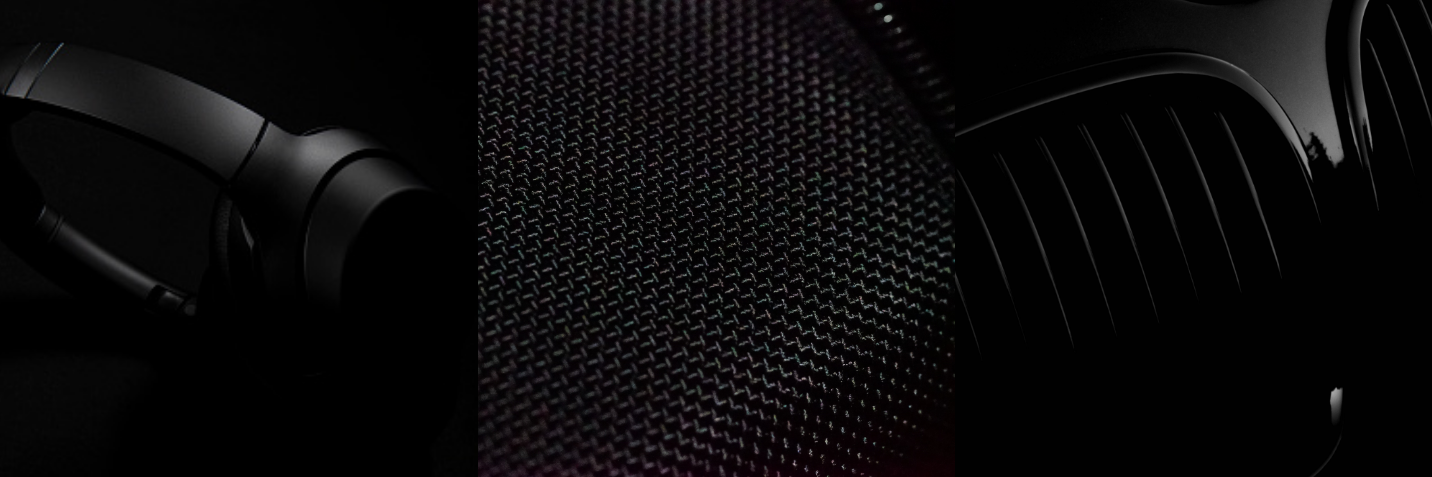
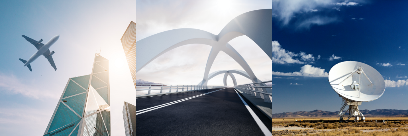
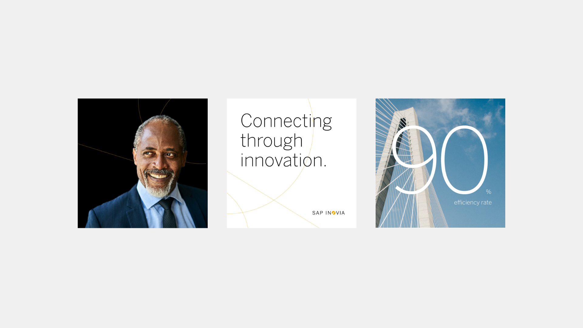
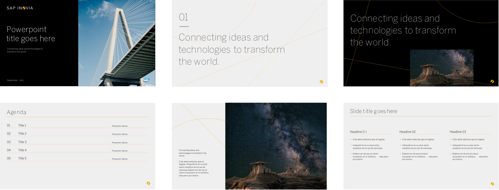
An elegant photography style was defined, focusing on materials and products, collaborations and industries, adding to the quality and premium feel of the brand.

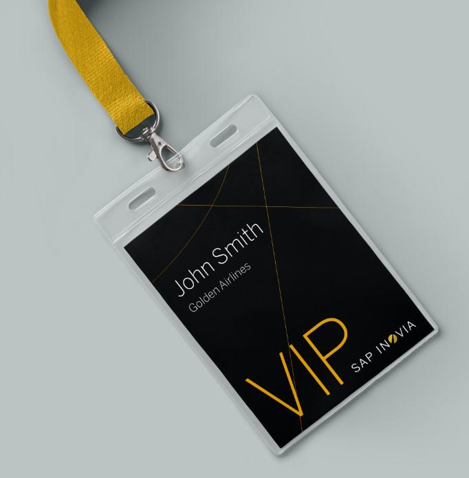
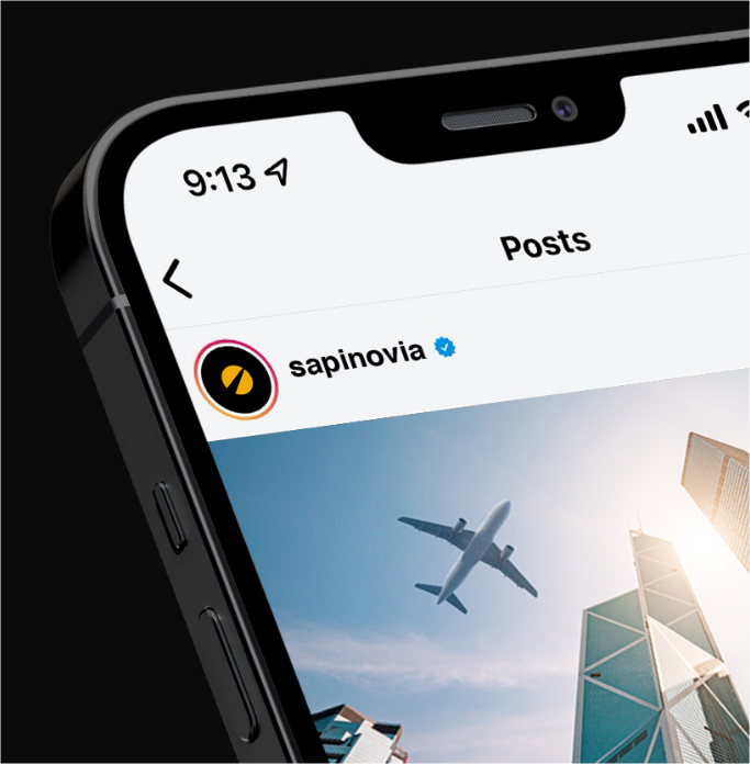
The flexible visual system easily extends to a range of applications such as digital backdrops, social media and print collateral.


It’s been a pleasure working with the entire team at Clarke on this project. We really appreciate the consistently high level of professionalism, creativity and quality deliverables … all while managing an aggressive timeline.