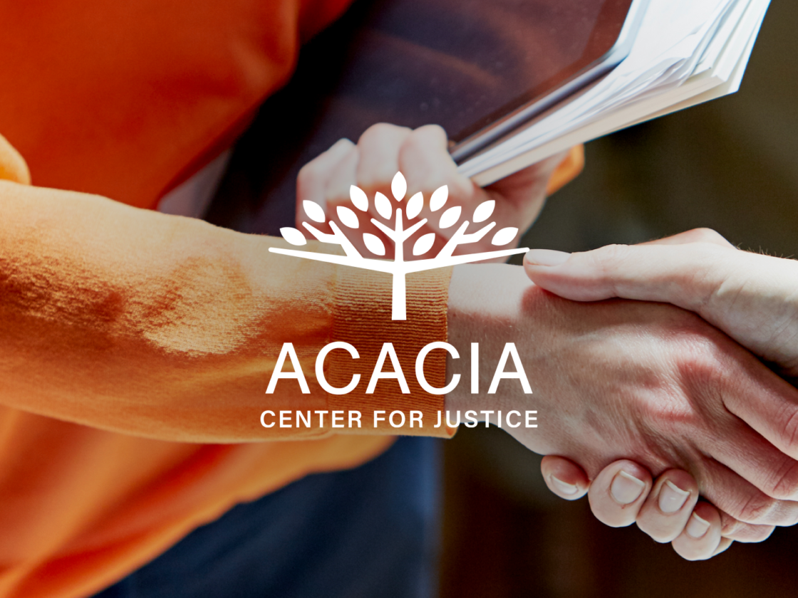
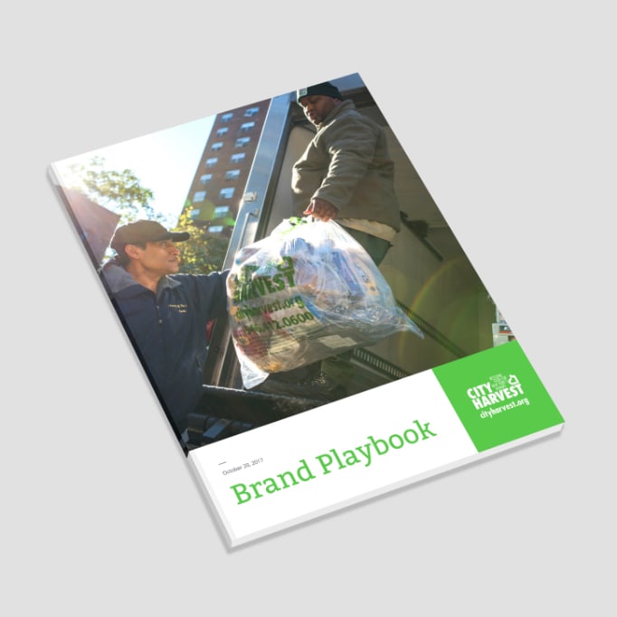
The playbook we developed, helps City Harvest create consistent materials and communications even when only limited in-house resources are available.
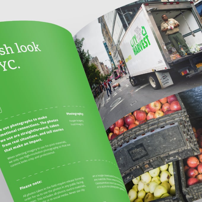
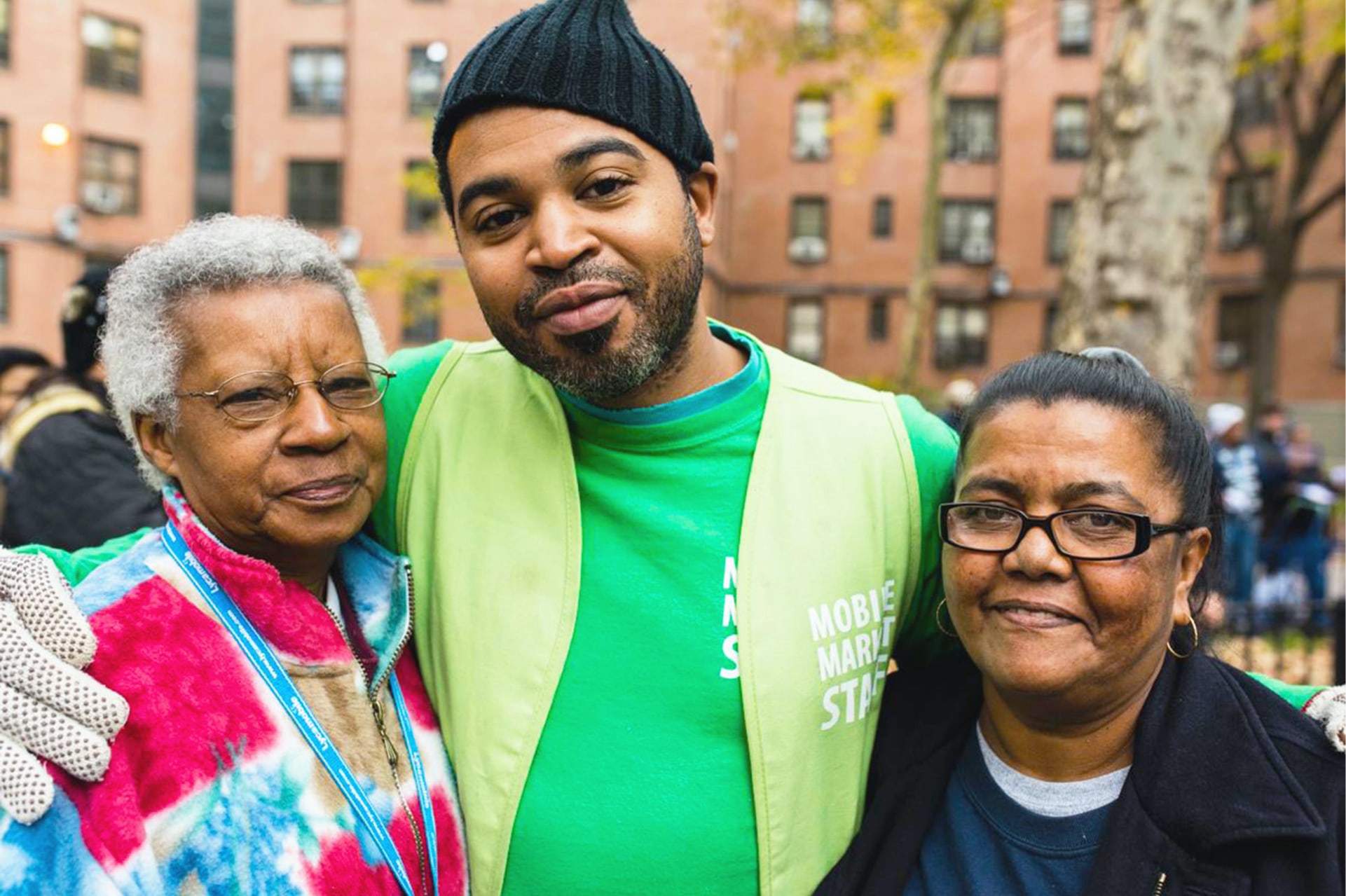
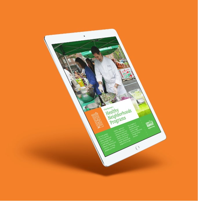
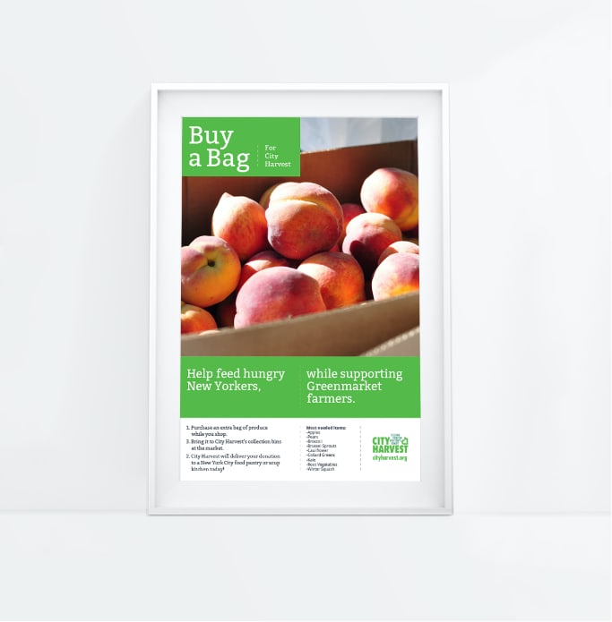
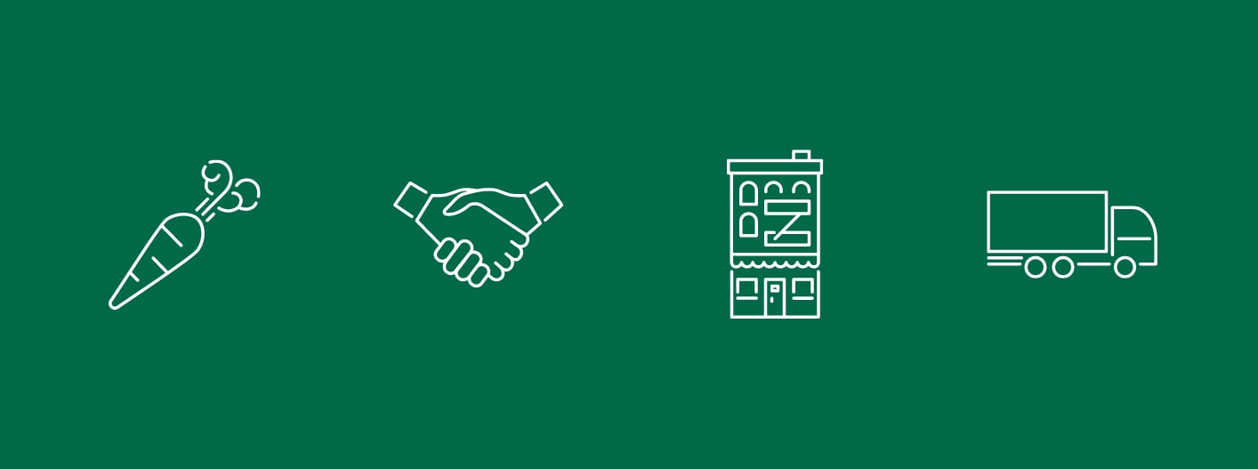
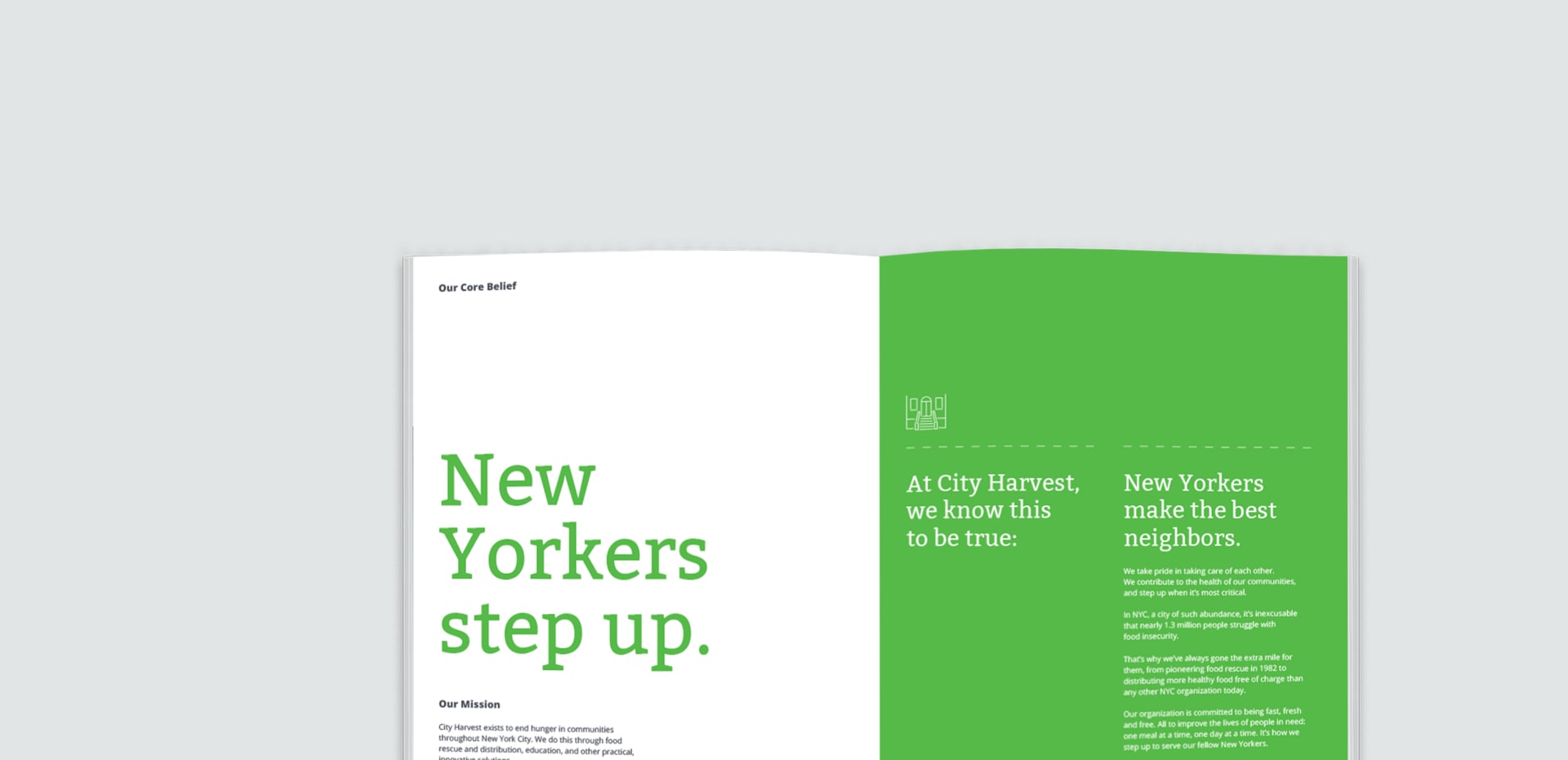
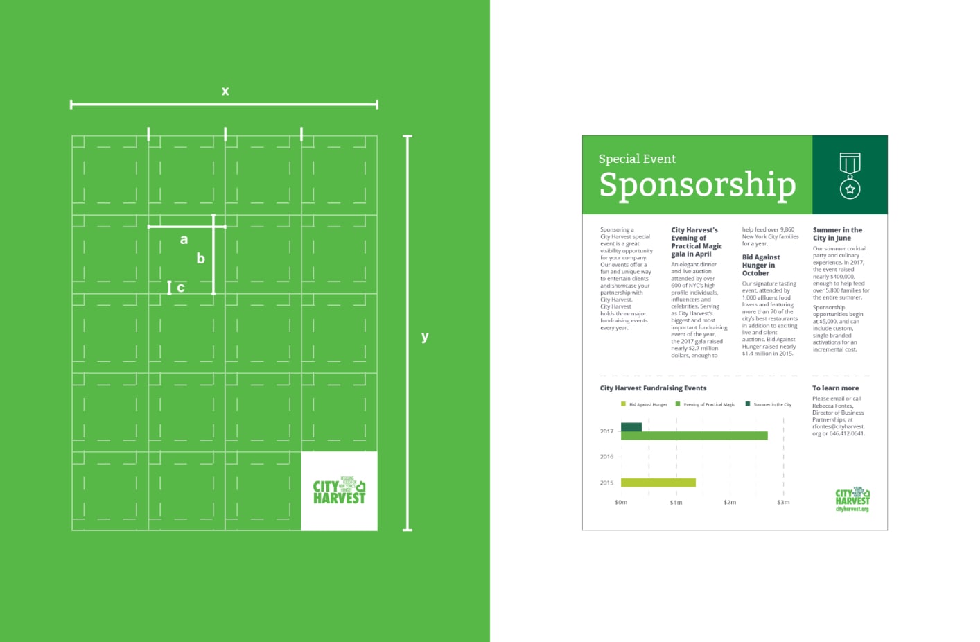
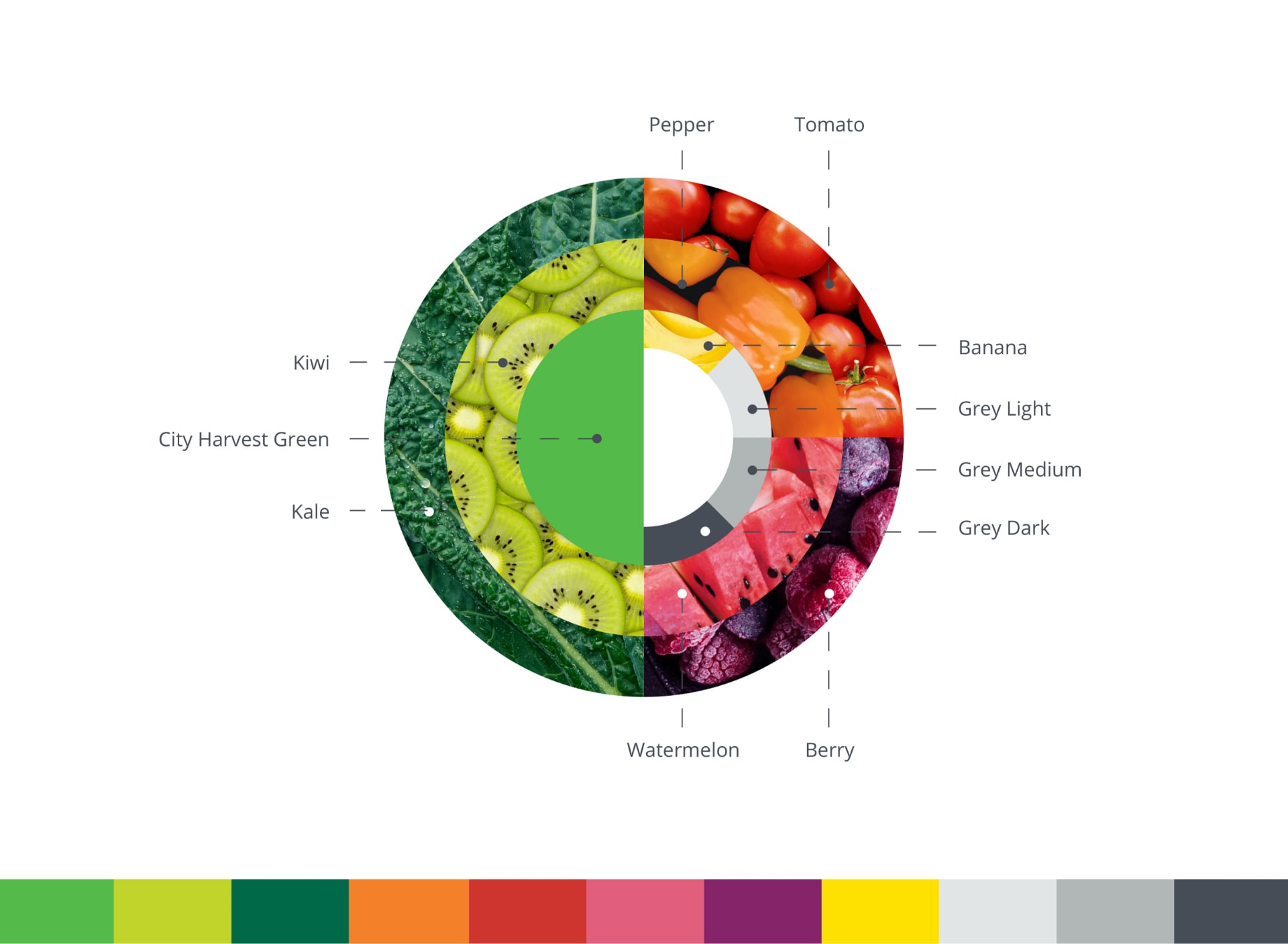
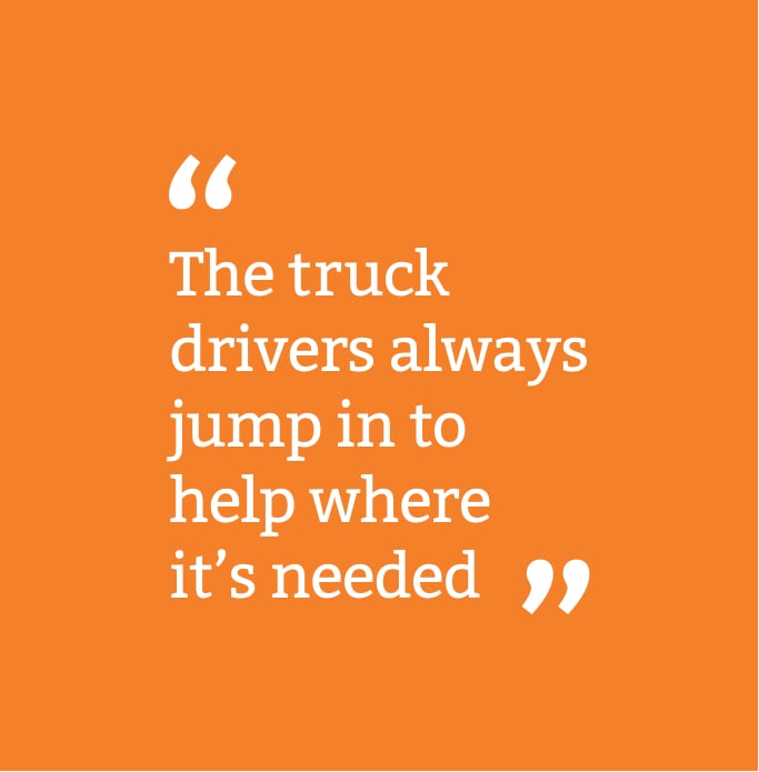
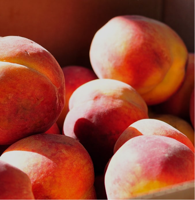
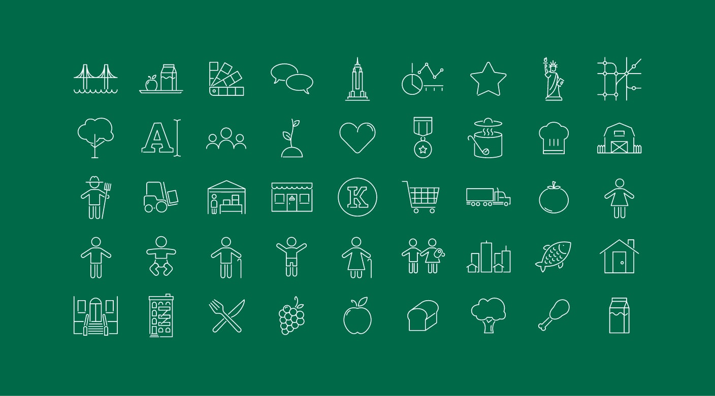
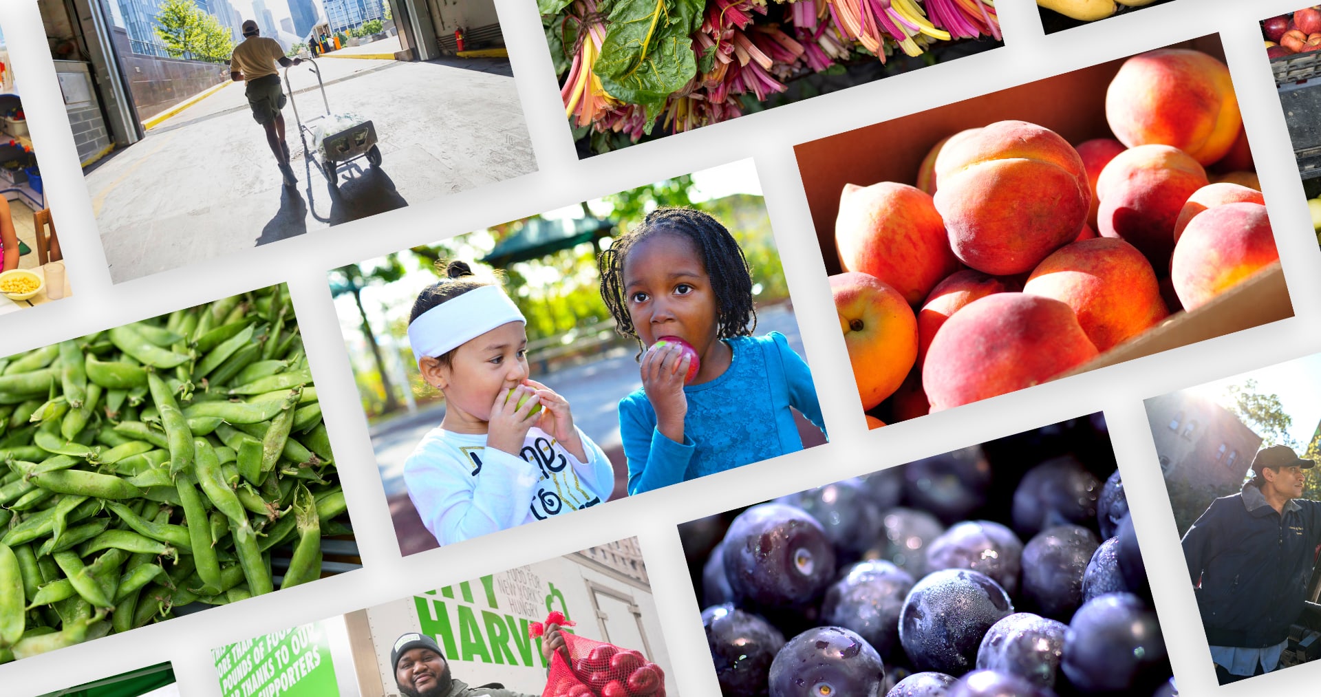
City Harvest works to address the challenge of food insecurity in NYC, rescuing and distributing over 600 million pounds of produce. It’s a vital resource in our city. So when the organization asked for an updated identity system to raise the brand’s profile, we were excited to help make it the true NYC icon it deserved to be. To evolve the brand we had to first find out what was and was not working. Through a deep audit, as well as ride-alongs in trucks and visits to distribution centers, we got to meet the people who power City Harvest, and discover which elements of the brand had meaningful equity. By clarifying the story, and crafting a mission statement, we were able to bring real focus to the brand. We brought this to life through an abundant fruit & vegetable-inspired color palette, a warm yet direct tone of voice, and a bountiful collection of icons, embodying City Harvest’s authenticity and generosity. Our brand style guide focused on helping the organization achieve consistent communications, with audience-specific messaging, visual guidance and templates. With smart tools – and clear vision – City Harvest could make even more impact.
Strategy Development / Brand Positioning / Style Guide / Publication Layout / Design System + Templates / Brand Identity / Brand Messaging / Motion Graphics + Video / Visual Design