Reltio
Reltio was repositioning itself in a crowded data market and needed a brand to match its ambition. Working alongside Prophet, we built a complete visual identity system that gave the company a distinctive, confident presence and the tools to scale it across every channel.
Reltio is a cloud-native master data management company helping enterprises turn complex, multi-source data into a single source of trusted information. As the company repositioned itself for growth, its existing visual identity wasn’t keeping pace. The brand needed to signal that Reltio was a category innovator, not just another player in a crowded field.
Working as Prophet’s embedded design team, we built the complete visual identity from the ground up on an accelerated timeline. The work began with an audit of existing materials and a deep dive into Reltio’s new brand strategy and narrative before moving into visual territory exploration. Three directions were developed and pressure-tested before a single direction was selected and taken to completion.


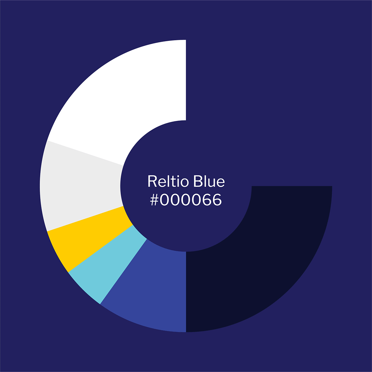
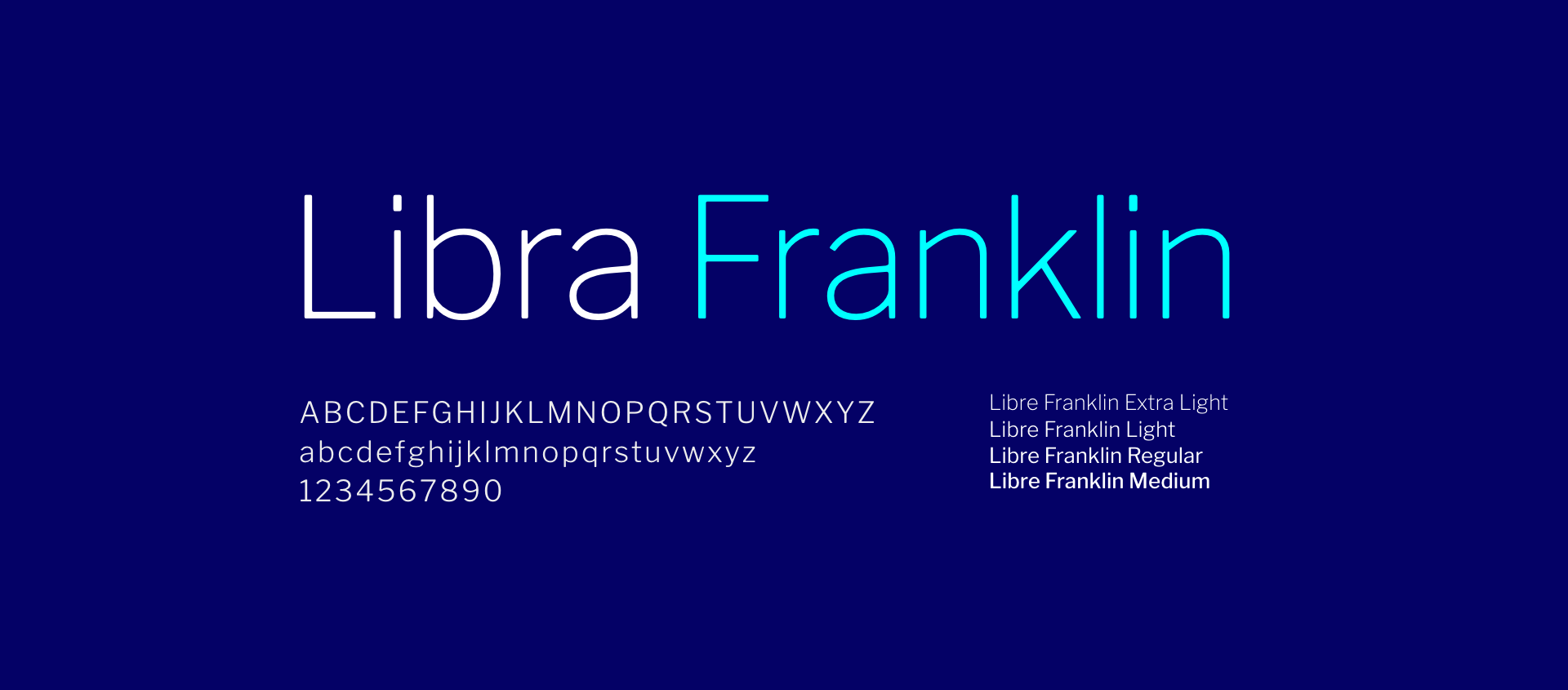
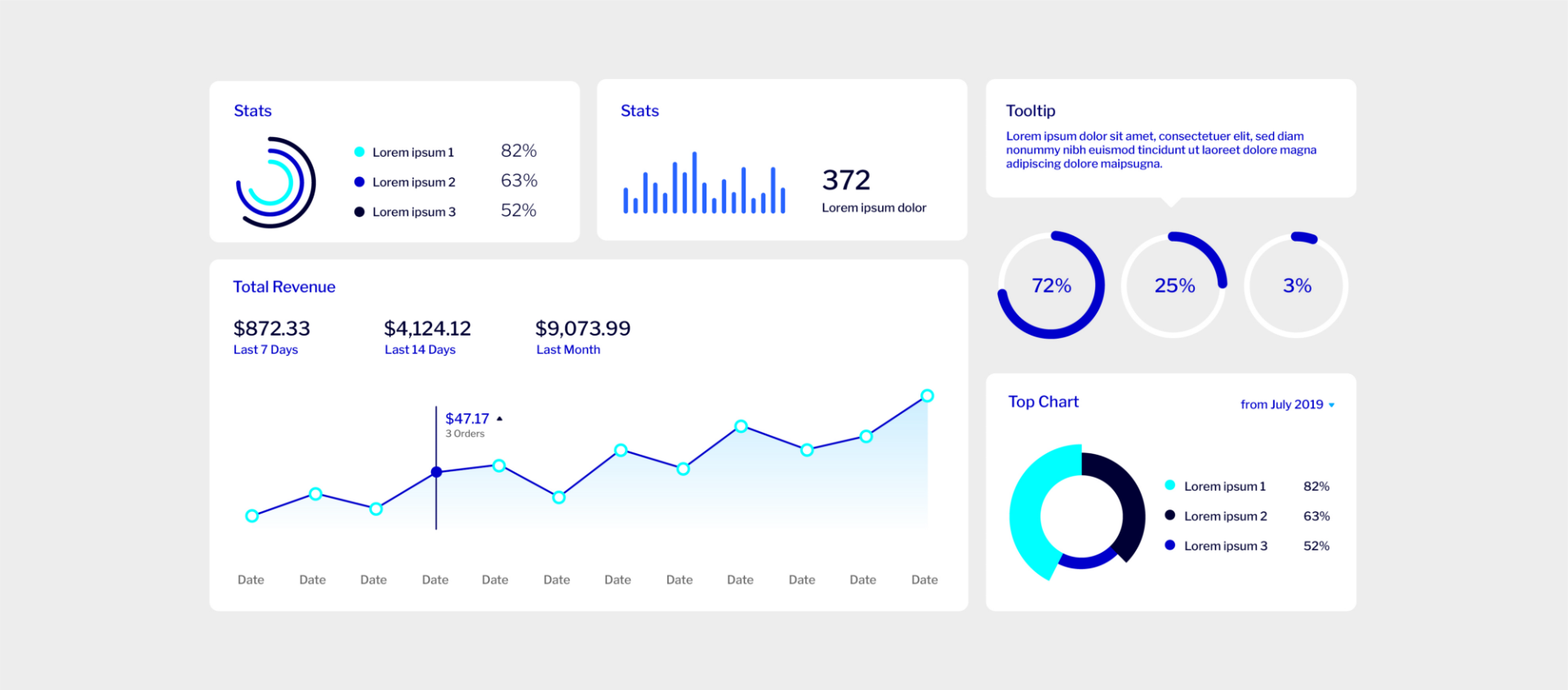
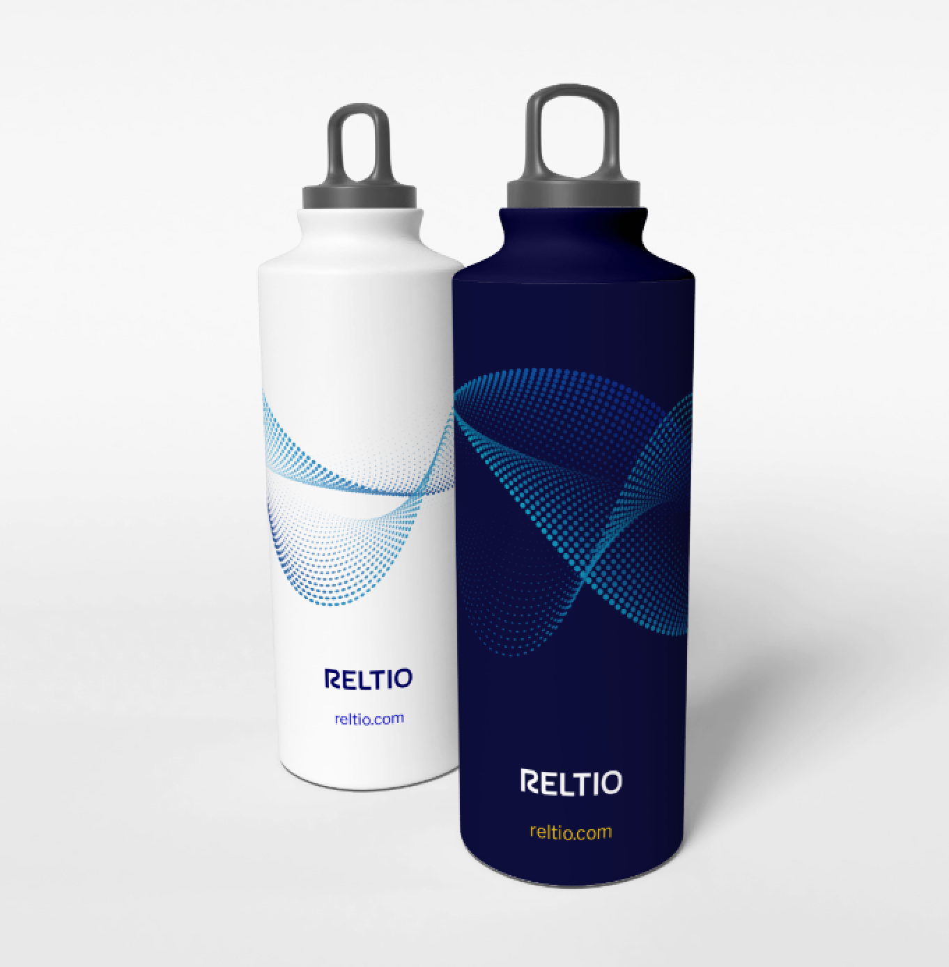
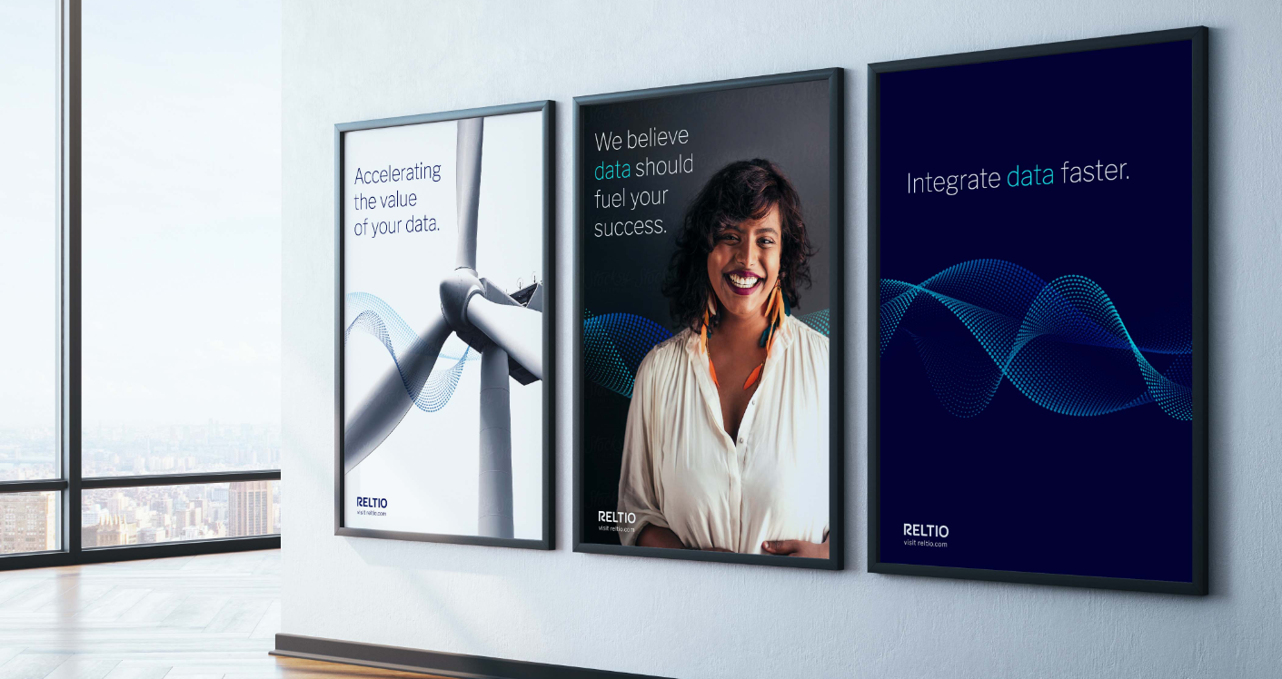
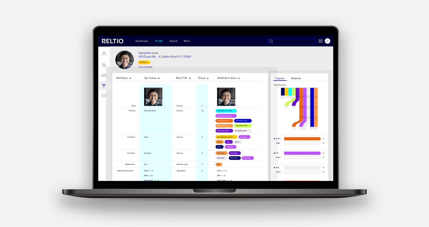
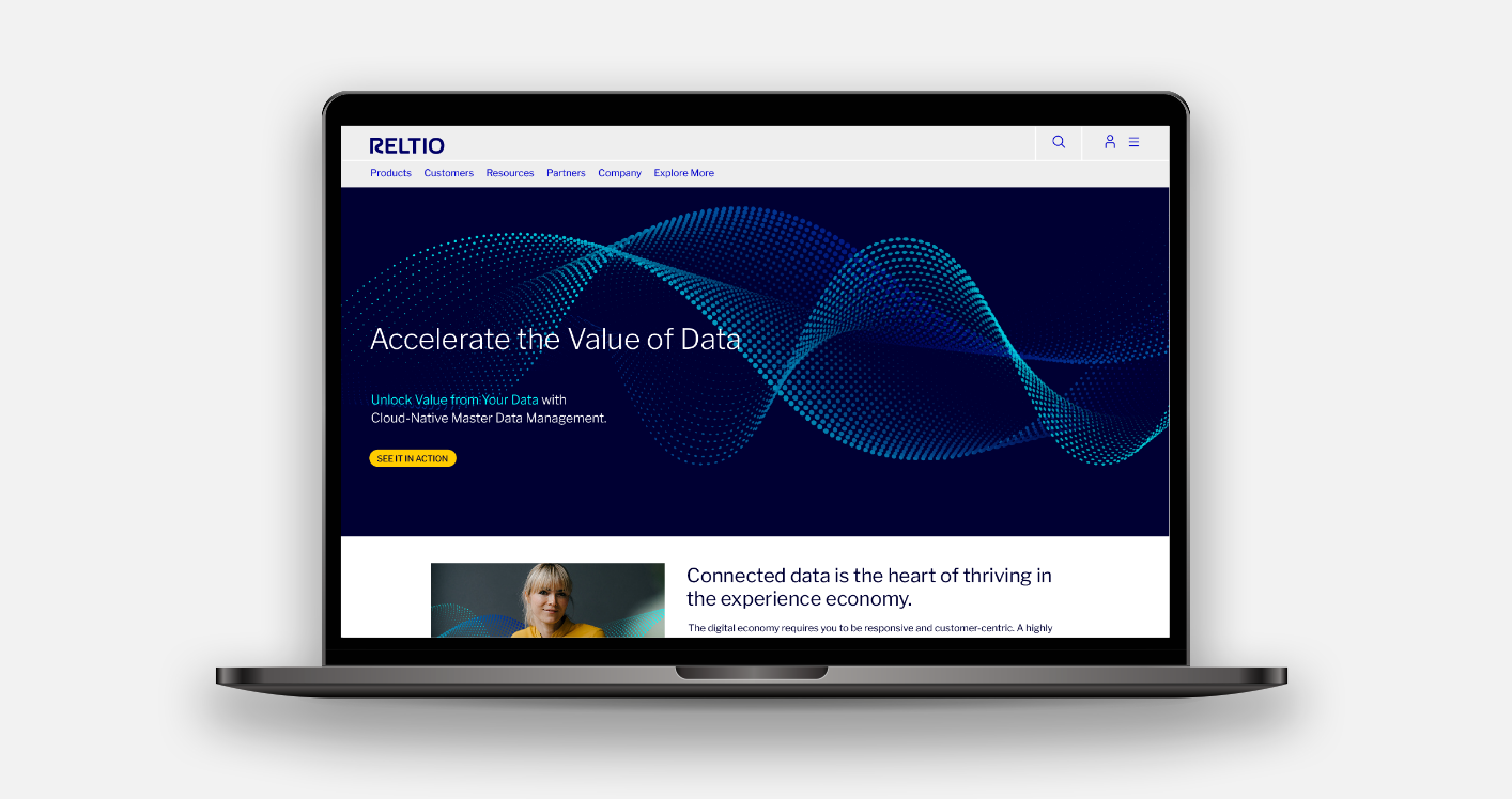
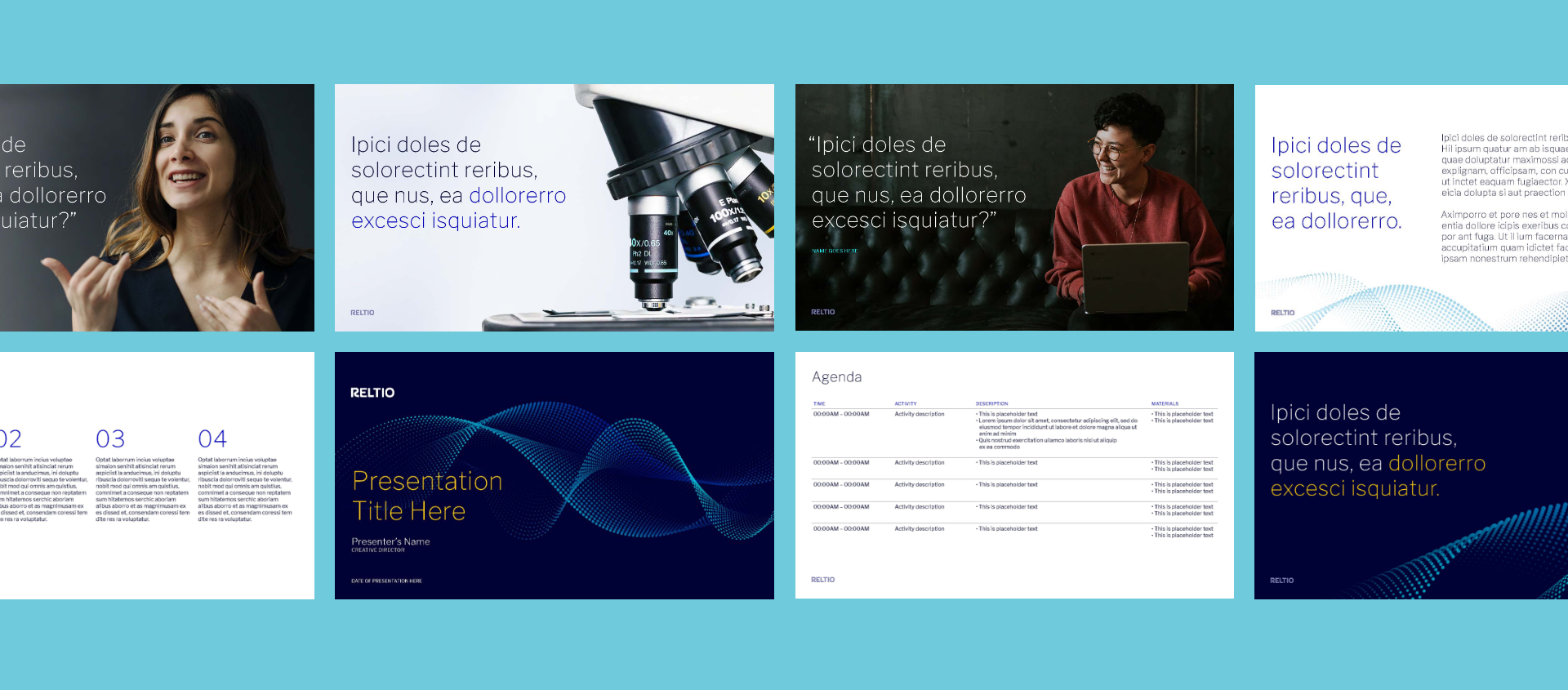
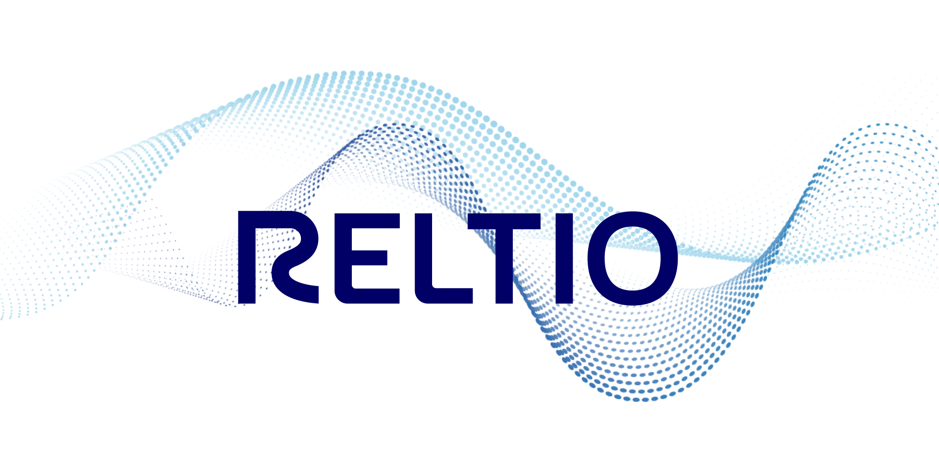
The identity is anchored by a custom-drawn wordmark with a flowing R that conveys motion, speed, and accelerating data value. A bold deep-navy and electric-blue palette, anchored by Reltio Gold and Reltio Aqua as accent colors, gives the system energy and confidence. The Data Wave, a signature graphic element composed of dynamic dot patterns, became the visual expression of Reltio’s core promise: complex data, synthesized and made useful. A custom icon library, built on a consistent grid system using the same linear and dot language as the wave, extended the identity into product and communications contexts.
The system was designed for scale. In six weeks, we developed and delivered the full visual identity, a comprehensive digital brand guidelines document, and applications across homepage, product UI, PowerPoint, data sheets, email templates, trade show booth, banner ads, and promotional materials. A brand ready to move as fast as Reltio itself.