Parker's Room
After its acquisition by First Place Pediatrics, Parker’s Room needed a brand to match its ambition, recognized across the industry and still close to the nurses who built it.
Parker’s Room Training Lab delivers the only accredited certification in pediatric home care nursing, a field where one nurse can carry ICU-level responsibility inside a family’s home. Built by nurses and grown from in-house training, it had earned real trust with the people it certified. Its acquisition by First Place Pediatrics opened a new phase of growth. We were brought in to evolve Parker’s Room into a clearly positioned brand, aligned with FPP while keeping an identity of its own.
We started with strategy, building a one-page positioning framework to align teams and guide every expression that followed. It defined the value proposition, a purpose centered on confident nurses and safer care at home, and a voice that was expert, compassionate, and empowering. We wanted a brand that could reassure without intimidating, speaking with authority to partners while staying close to the nurses and parents at its heart.

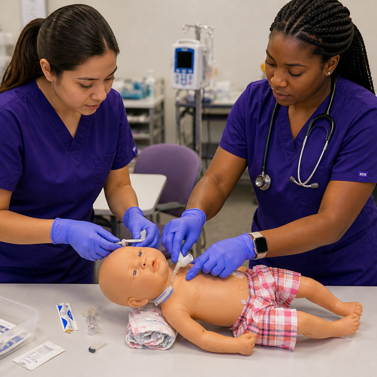
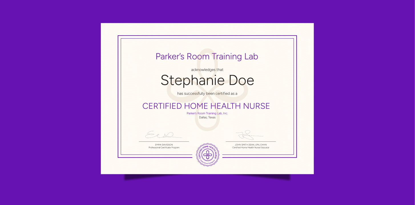
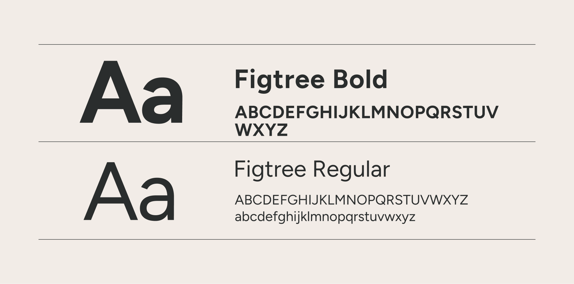
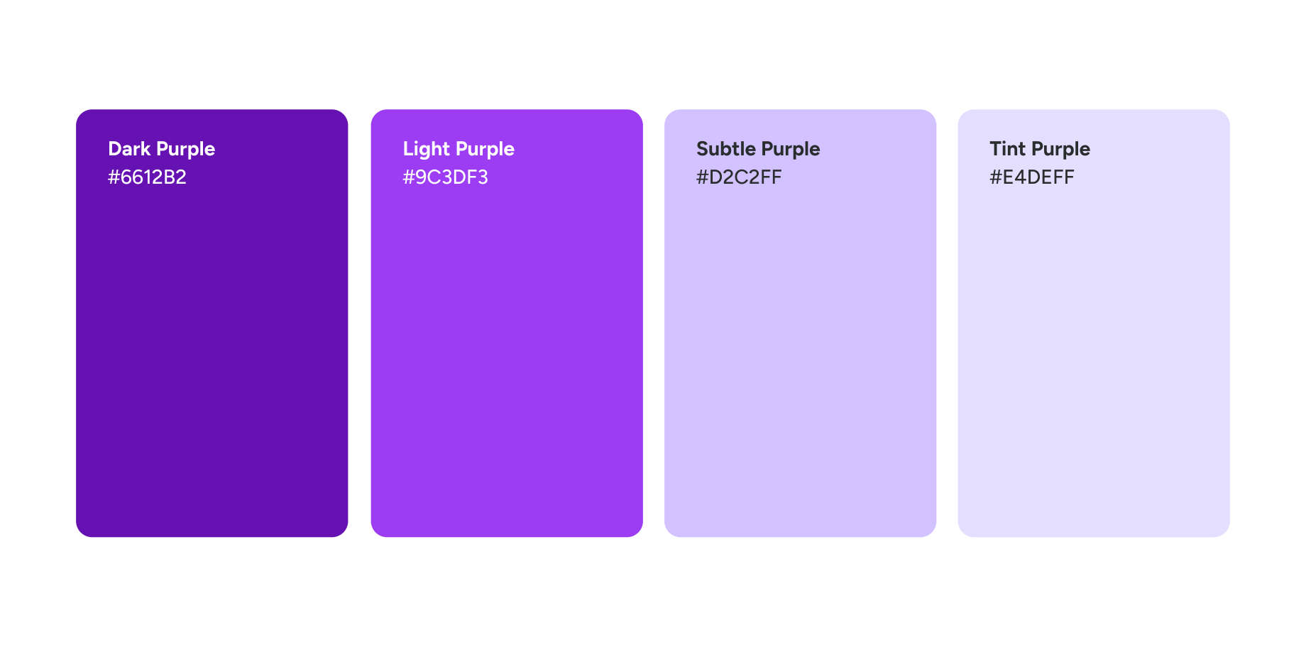
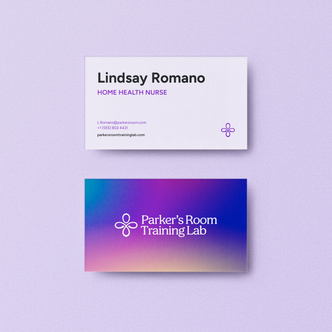
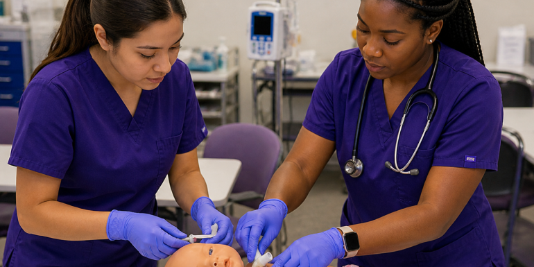
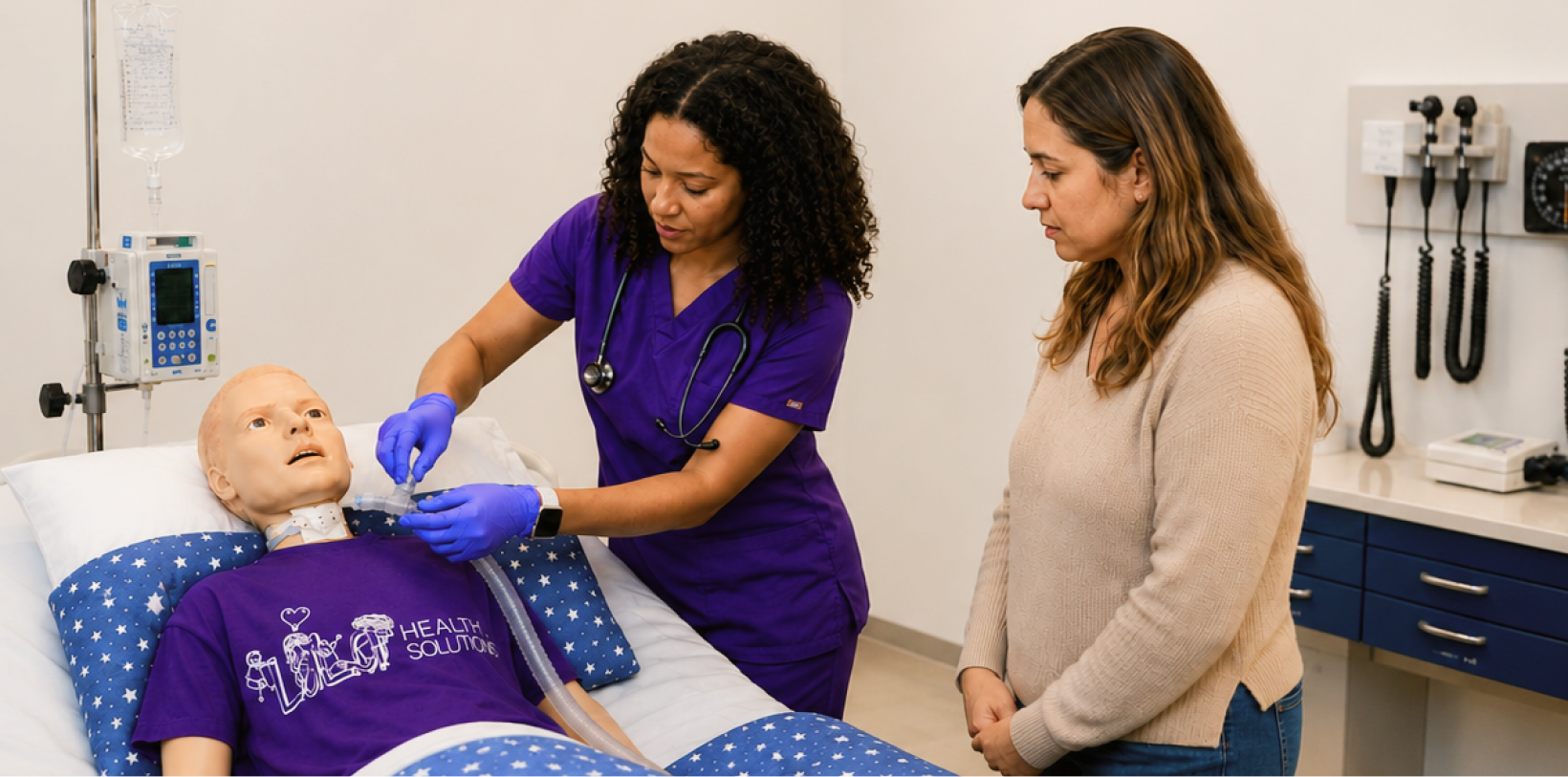
From that foundation we built a complete identity system. We refined the logo and symbol, designed a purple-led palette with warmer accents, set the type in Figtree, and created a radial gradient system with clear rules. The Certified Home Health Nurse badge marked the credential itself, photography grounded it in the real simulation lab, and a focused style guide brought it together. Parker’s Room now carries a brand recognized across pediatric care, distinct from First Place Pediatrics yet aligned with it, and still close to the nurses who believed in it from the start.