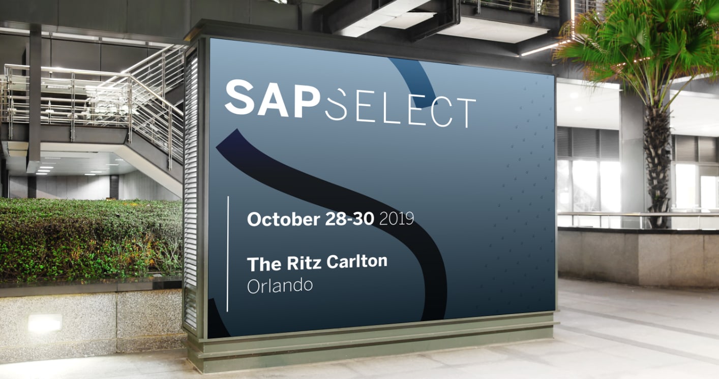

SAP Select is an invite-only experience for important clients. It needed a visual identity as premium and exclusive as the event itself – while still being part of the SAP family.
Our guiding principles? Simplicity and quality.
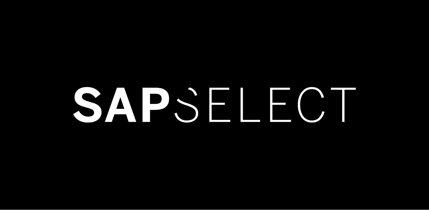
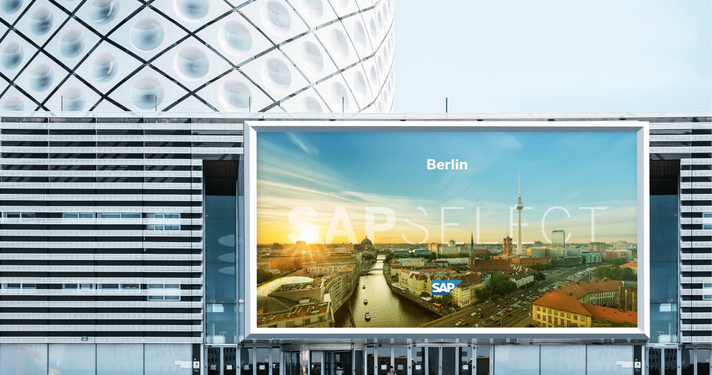
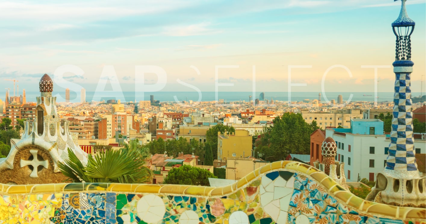
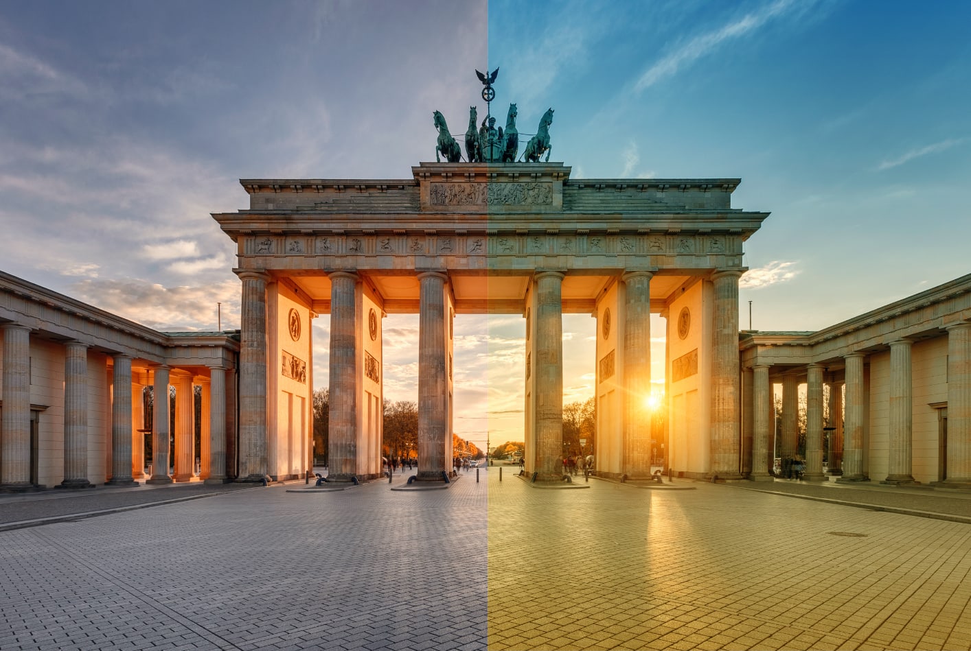
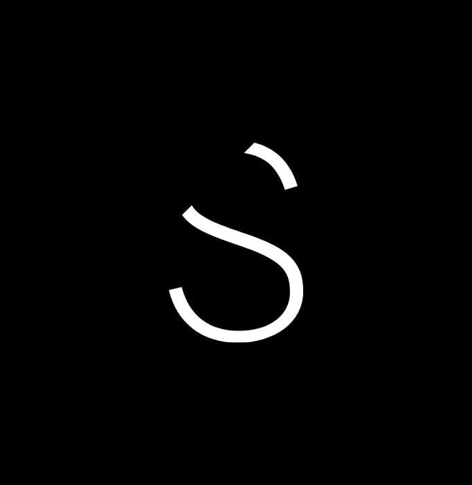
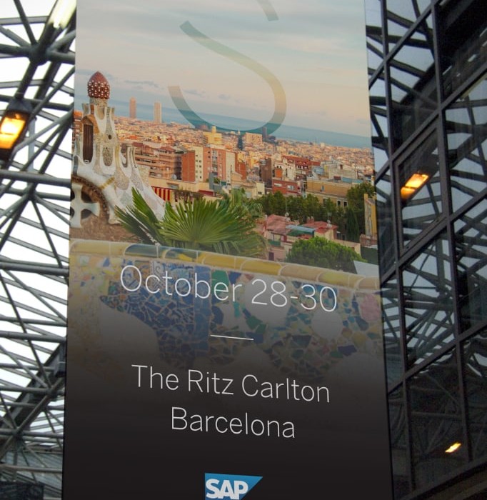
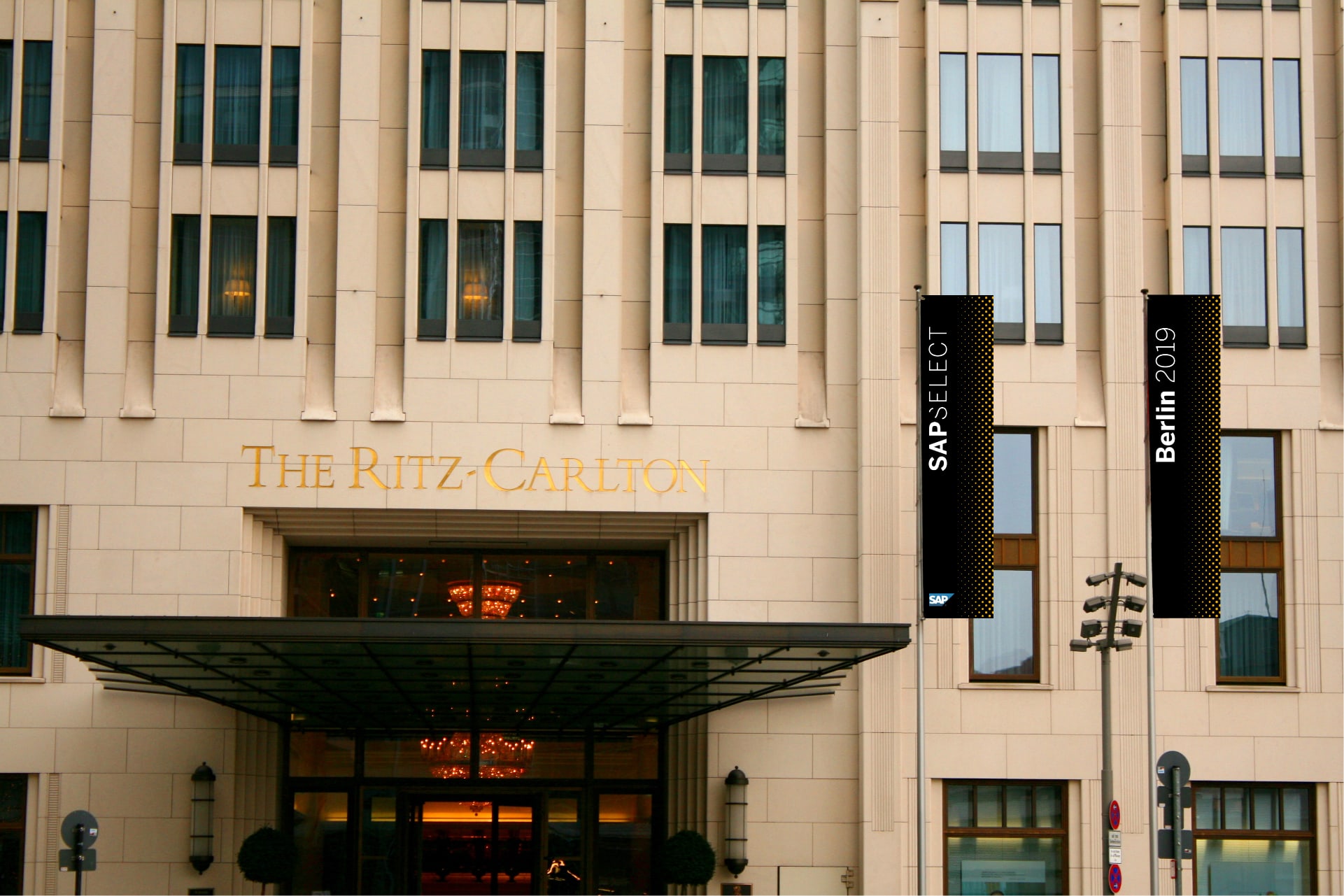
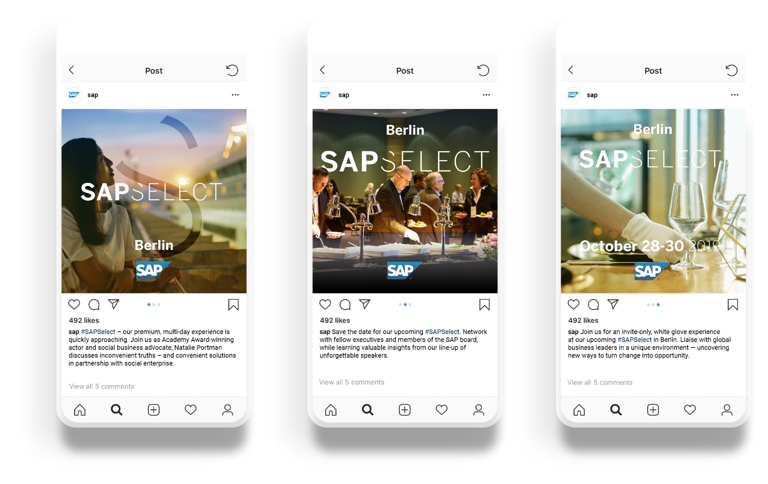
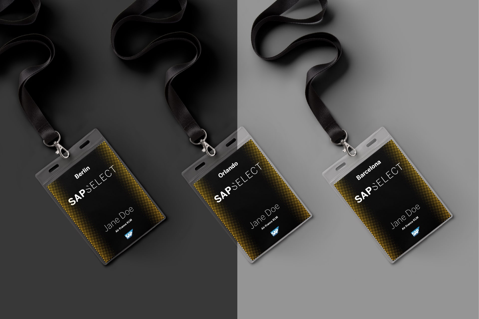
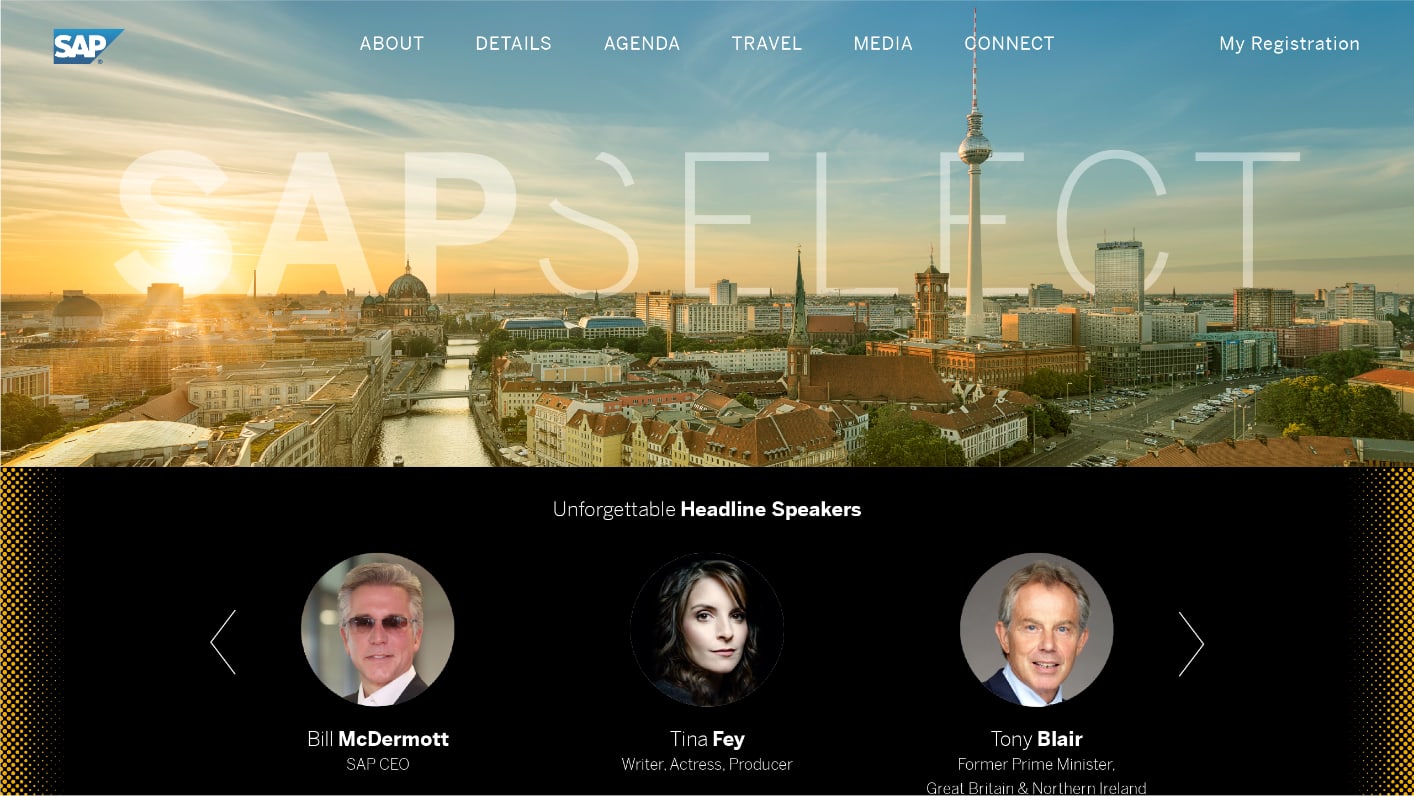
We selected a limited range of colors from SAP’s palette, focusing on gold, white and black. Photography featured iconic architecture from cities where SAP Select was being hosted. Finally, the new wordmark used SAP’s existing font and referenced the historic anvil logo with a distinctive cut in the “S”.
The new visual identity represented everything SAP Select sought to embody—a premium feel, and exclusivity without pretension.
Visual Identity / Style guide / Logo Design / Art Direction / Design System / Templates / Motion Graphics + Video / Band Identity / Brand Messaging